Dog-centric: increasing a pet e-commerce sales by 70%
Situation
Dog U is a Brazilian e-commerce company specializing in dog collars and accessories. Despite their high-quality, well-loved products, the website underperformed — product pages didn’t reflect craftsmanship, the homepage felt generic, and mobile conversions were very low despite high traffic. The company needed a redesign to better reflect its brand, engage dog lovers, and increase sales.
Task
As the lead designer, I was responsible for the entire end-to-end redesign process. My goals were:- Create a mobile-first experience that would increase conversions.
- Replicate the tactile, emotional connection customers felt in-store.
- Infuse the brand with personality to resonate with dog owners.
- Deliver results under a tight timeline, completing research in just two days.
Action
I approached the challenge with lean but high-impact methods:
- Research:
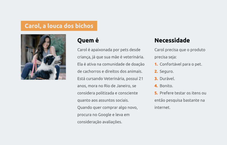
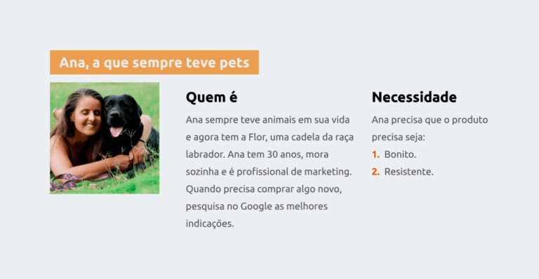
- Semi-structured interviews with dog owners to uncover purchase motivators (comfort, durability).
- Competitor analysis and social media review for inspiration on personalization.
- Google Analytics deep dive to identify weak points in mobile conversion.
- Desk research (comScore) to validate barriers like unclear product details and security concerns.
- Design strategy:
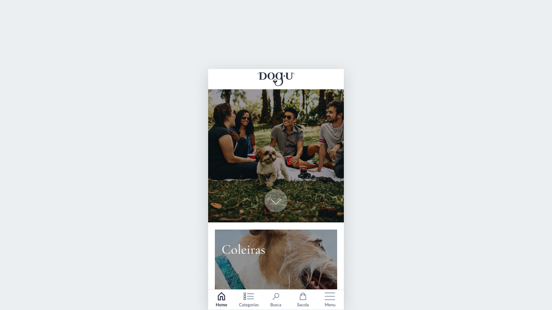
- Mobile-first bottom navigation tailored for iPhone users.
- Product pages redesigned with zoomed-in visuals and copy emphasizing comfort and safety.
- Personalization features (e.g., dog’s name and birthday input field).
- Social proof through Instagram integration and customer testimonials.
- Playful “dog-centric” tone of voice to match the brand.
- Design process & iteration:
- Created wireframes and prototypes in Figma.
- Conducted usability testing with dog owners → improved call-to-action visibility and checkout flow.
Result
The redesign exceeded expectations and delivered measurable business impact:
- +70% sales increase after launch.
- Improved mobile conversions with significantly reduced bounce rates.
- Positive customer feedback: users praised the navigation, visuals, and personalized features.
- Long-term validation: Five years later, the redesigned site still retained key elements of this work.
Visit Dog U’s e-commerce (checked five years later, in September 2023) and the Figma file.
Reflection and learnings
- Tight timelines can still yield deep insights if research is focused and lean.
- Personalization and social validation significantly build trust and engagement in e-commerce.
- Mobile-first thinking isn’t optional — it’s essential for conversion success.
Future opportunities
- AR product try-ons.
- Dynamic personalization with tailored product recommendations.
- Advanced analytics to keep refining the experience.